
GROOV3
Evolving the visual identity for LA's hottest dance party
Challenge: Refine GROOV3's positioning within the crowded space of dance exercise classes.
Strategy: When in doubt, go back to the 'why'. Inspired by GROOV3's origin story, we reminded audiences of its legacy as an ambassador of community and top-grade ethos.
Result: Both class sign-ups & instructor training registrations blew up and the GROOV3 family got a whole lot bigger.
Role: Creative Director

When authenticity
meets empowerment
Some soul searching was conducted to clarify GROOV3's voice and pinpoint what they offer their students. Boiling this down to a succinct key phrase provided a north star; a filter through which
to evaluate new ideas as we developed a fresh visual identity.


Realigning with
a fresh vision
We drew inspiration from GROOV3's legacy: community and inclusion.
In the spirit of authenticity, the logomark design is simplified to its core elements and the lockup now displays the brand's ubiquitous tagline. Finally, a subtle glare is added, giving a distinct polish and conveying
GROOV3's commitment to providing everyone a first-class experience.


One community
united by dance
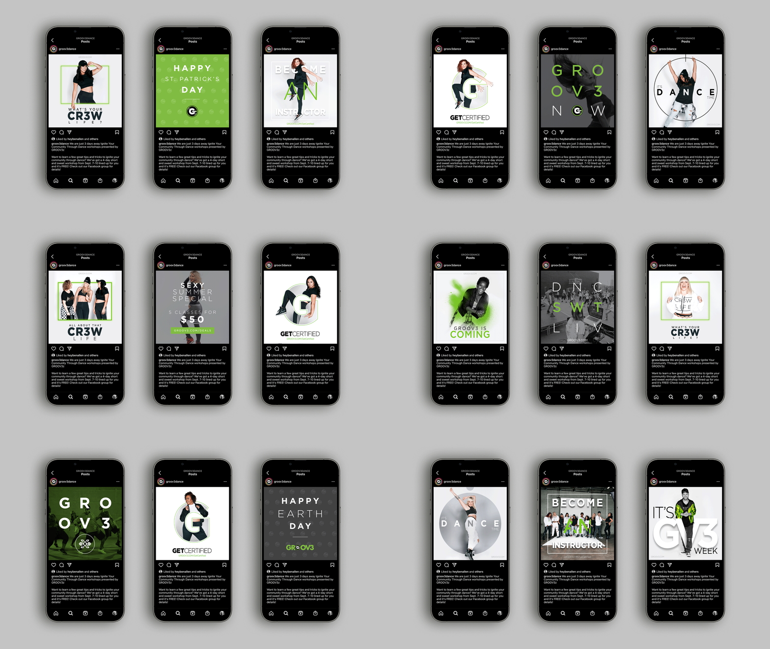
Informed by a more authentic logomark, the typography and brand iconography exude a similarly restrained linear style.
Support from minimal touches of color results in a clean yet
lively playfulness. Cohesion across print, digital, social media, and merchandise ensures unity throughout all touchpoints.







Taking the class.
Ben (GROOV3 founder) is a positivity & motivational king!
The energy during his classes is electric, and as a dance machine myself the experience was unforgettable.
